CSS3の枠線の角を丸くするサンプルです。
border-radiusプロパティを使用します。
目次
border-radius プロパティ
| border-radius : 値 → 4つの角を指定 border-radius : 値 値 → 左上と右下、右上と左下を指定 border-radius : 値 値 値 → 左上、右上と左下、右下を指定 border-radius : 値 値 値 値 → 左上、右上、右下、左下を指定 (時計回りです) |
| 値 | 説明 |
|---|---|
| 数値 + 単位 | 指定した単位で設定します。 |
| 数値 + % | 水平方向はボーダーボックスの幅、垂直方向はボーダーボックスの高さを参照します。 |
| 値を継承しない | |
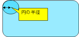
- 角を丸くします。
- 設定する値は丸くなる部分の円の半径の長さです。
- 以下はMDNの border-radiusプロパティのリンクです。
https://developer.mozilla.org/ja/docs/Web/CSS/border-radius
サンプル
border-radiusプロパティで角を丸くするサンプルです。
test1
border-radius:10px
border-radius:10px
test2
border-radius:30px
border-radius:30px
test3
border-radius:10%
border-radius:10%
test4
border-radius:30%
border-radius:30%
コード
上記サンプルのコードです。
test1とtest2は値をpxで指定しています。
test3とtest4は値を%で指定しています。
<style>
#test1{
	border-radius:10px;
}
#test2{
	border-radius:30px;
}
#test3{
	border-radius:10%;
}
#test4{
	border-radius:30%;
}
.c1 div{width:300px;border: 1px solid #000;text-align:center;
margin-bottom:20px;height:50px;background-color:#E0FFFF;}
</style>
<body >
<div class="c1">
	<div id="test1" >test1<br>border-radius:10px</div>
	<div id="test2">test2<br>border-radius:30px</div>
	<div id="test3">test3<br>border-radius:10%</div>
	<div id="test4">test4<br>border-radius:30%</div>
</div>
</body>
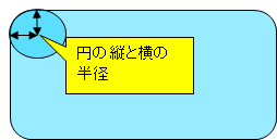
角を楕円形にする
| border-radius : 値1 / 値2; |
- border-radiusで、2つの数値をスラッシュ区切りで指定すると角が楕円形になります。
- 値1が円の横の半径です。
- 値2が円の縦の半径です。
サンプル
border-radiusの角を楕円形にするサンプルです。
test5
border-radius:10px/30px
border-radius:10px/30px
test6
border-radius:30px/10px
border-radius:30px/10px
コード
上記サンプルのコードです。
test5は円の半径の横を10px、縦を30pxで指定しています。
test6は円の半径の横を30px、縦を10pxで指定しています。
<style>
#test5{
	border-radius:10px/30px;
}
#test6{
	border-radius:30px/10px;
}
</style>
角を個別に指定する
角を個別に指定する方法です。
| 指定方法 | 意味 |
|---|---|
| border-top-left-radius 例:border-top-left-radius:10px; |
左上を指定 |
| border-top-right-radius 例:border-top-right-radius:10px; |
右上を指定 |
| border-bottom-right-radius 例:border-bottom-right-radius:10px; |
右下を指定 |
| border-bottom-left-radius 例:border-bottom-left-radius:10px; |
左下を指定 |
関連の記事
CSS 背景色を指定するサンプル(background-color)
CSS 背景画像を指定するサンプル(background-image)
CSS 背景画像の繰り返し方法を指定するサンプル(background-repeat)
CSS3 ボックスに影をつけるサンプル(box-shadow)
CSS3 文字に影をつけるサンプル(text-shadow)
CSS3 透明度を指定するサンプル(opacity)
CSS3 線のグラデーションのサンプル(linear-gradient)
CSS3 円のグラデーションのサンプル(radial-gradient)